A Registration Problem That Revealed a System Problem
The National COVID Cohort Collaborative (N3C) is an NIH-funded program providing researchers with access to one of the largest harmonized COVID-19 clinical datasets in the United States — housed within a secure Palantir Foundry enclave managed by NCATS. Getting access requires navigating a multi-step process: institutional data agreements, identity verification, security training, enclave selection, and role-based approvals at the institutional and federal level.
The existing system had been built incrementally over years and showed it — a registration portal with redundant navigation, no sequential structure, no status visibility, and an agreement submission process that relied entirely on email with no timestamps, no confirmations, and no admin visibility. Researchers stalled. Administrators had no way to know why.
The brief started as a registration redesign. As prototype reviews drew in NCATS technical leadership, governance stakeholders, and policy requirements from the incoming CADR federal framework, the scope expanded into a full enterprise access management system covering six user roles, lifecycle management, institutional governance, a DAR review committee, and an admin dashboard with reporting.

Sole Designer on a System Built for Scientists
UX/UI Design Lead — Axle Informatics for NCATS
I was the only designer on the project, embedded within an Axle Informatics team contracted to NCATS. My primary working relationship was with the N3C Program Lead — a research scientist who served as both product owner and subject matter expert, translating federal policy requirements, CADR governance mandates, and stakeholder feedback into PowerPoint briefs and structured check-in sessions. I translated these into clickable Figma prototypes reviewed by the NCATS Technical Lead and presented to NIH senior leadership.
What I Owned
- Discovery and current-state audit — documented every broken pattern in the existing system via structured stakeholder walkthroughs
- Information architecture — defined navigation, role-based views, and sequential flow logic across all six roles from scratch
- All six user flow designs — Researcher, Principal Investigator, Legal Representative, ISO Approver, Data Contributor Reviewer, and Contractual Partner
- Lifecycle design — onboarding, enclave management, and offboarding flows for researcher accounts
- Admin Dashboard and Org Pages — full OpsAdmin interface including DAR committee review, institution management, reporting, and whitelist workflows
- Iterative prototyping — Lucidchart for early skeletons and flow diagrams, Figma for all full clickable prototypes presented at review sessions
- Design system decisions — icon state language, persistent alert patterns, naming conventions, and attestation modal patterns applied consistently across all roles
- Stakeholder presentation prep — structured and sequenced prototype narratives for DAME reviews and presentations to NCATS senior leadership
Walking Through a System That Was Working Against Its Users
Discovery began with the N3C Program Lead screen-sharing the existing registration system and walking through it as a new user would encounter it. What emerged was a catalogue of compounding friction — each individual issue manageable in isolation, but together creating a process that routinely stopped researchers before they reached the enclave.
What the Existing System Was Doing Wrong
No sequential path
Users were presented with a list of required steps in no particular order — no dependencies surfaced, no indication of what to do when a step was blocked, no way back to the same state after leaving a page.
Redundant, confusing navigation
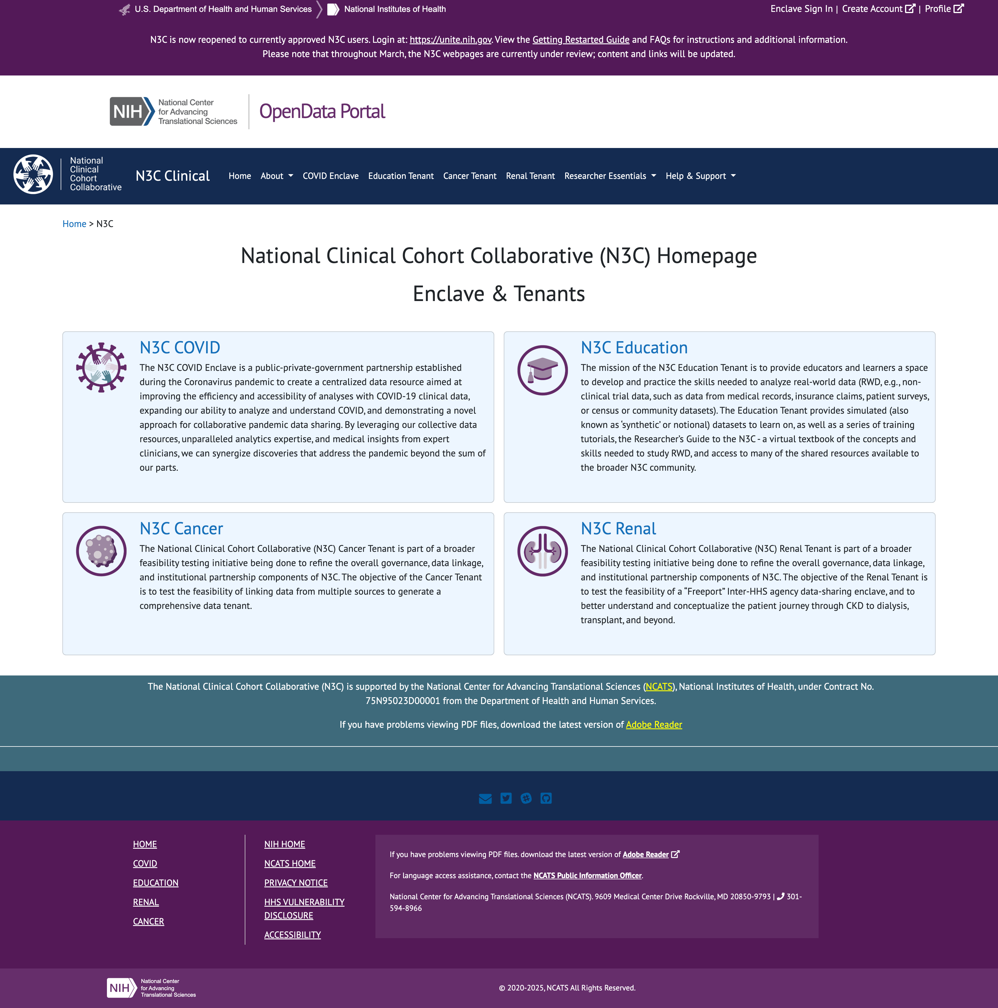
"Create Account," "Login," "Enclave Sign In," and "Profile" all occupied the same nav bar — pointing to different systems with no explanation of which to use, or when.
No status visibility
After submitting a profile, researchers had no way to know where their application stood. Approvals could take weeks with no indicator, no estimated timeline, and no contact path.
DUA black box
Institutions submitted Data Use Agreements by emailing NCATS partners directly. N3C had no visibility, no timestamp, and no notification — agreements sat unprocessed for weeks with no one aware.
Silent blockers
Missing required fields like an ORCID ID were only surfaced after submission. Users who hadn't completed them couldn't progress but received no clear instruction on how to resolve the block.
Layout working against comprehension
The landing page split onboarding instructions and the registration button across two visually disconnected columns. Dense disclaimer copy sat above the fold where no one read it.
Policy Context — CADR Governance
Layered over the UX problems was a significant shift in federal policy. The CADR (Controlled Access Data Repository) framework introduced new requirements that directly shaped the information architecture — mandatory institutional affiliations, required signing officials on data access requests, and a role structure distinguishing who could initiate requests from who could approve them. These weren't constraints to work around; they drove the role-based architecture from the ground up.
The Brief That Became a System
The engagement started with a single mandate: fix the registration experience. The existing process had been built incrementally across years of feature additions and was comprehensively broken — not in one way, but in every way a registration flow can fail simultaneously. The first working session on May 23, 2025 was a live walkthrough of the existing system with the N3C Program Lead. What followed was a documented audit of compounding failure.
"Registration will be a feature. Reporting will be a feature in this... it's going to be a system."
That shift — from "fix registration" to "this is a system" — happened in the first hour of the first call. It set the direction for everything that followed.
What the Existing Registration Was Doing Wrong
Three entry points, no hierarchy
"Create Account," "Profile," and "Enclave Sign In" appeared as equal-weight nav items — two went to the same place, one went somewhere else entirely. After completing registration, "Create Account" persisted on screen. "I don't understand that. It would be nice if it would disappear."
No sequential path
The process was a numbered checklist with no enforced order, no way back once you left it, and no mechanism to surface what was missing. "I found it once and took a screenshot, but you can't easily get back to it."
Help that offered no help
Guidance links were present but non-functional in practice. "There's a spot where it says if you'd like help or guidance — click here — and it takes you to something that offers neither help nor guidance."
DUA submission was a black box
Agreement submissions were handled entirely by email with no system visibility. "It can sit there for 2–3, four weeks and we have no visibility that they've submitted their DUA. And then somebody's like, hey, I sent that two weeks ago."
Silent failures
When registration stalled — missing ORCID ID, no DUA on file, unqualified email address — nothing happened. No notification, no prompt, no path forward. The Program Lead received the follow-ups manually by email: "Oh, you don't have your ORC ID. Let me give you the instruction... It doesn't do that."
No qualification gate
Gmail and non-institutional addresses were accepted, allowing users through who didn't meet the access criteria. "The current system just let people move in." CADR requirements mandated that everyone be affiliated with a verified institution — the system had no mechanism to enforce this.
First Session Finding — May 23, 2025
"I know the website pretty well and I couldn't find it really easily this morning when I was looking about how would I renew." — N3C Program Lead, on attempting to locate the registration checklistThis wasn't a usability edge case — it was the person who built the process being unable to navigate it. The checklist was structurally inaccessible: reachable once, nearly impossible to return to, with no persistent status or re-entry point.
What the Redesign Addressed
The redesign replaced every broken pattern with a direct structural counterpart. A single consolidated login and registration entry point replaced the three competing nav items. A sequential progress bar with explicit state feedback — complete, in progress, pending admin action, locked — replaced the unstructured checklist. DUA checking moved in-system, with an automatic lookup on institution name entry returning a green confirmation or routing to a decision tree. Agreement submission moved from email to a drag-and-drop upload with submission timestamps and status visibility. And crucially, the model became explicitly parallel: training, identity verification, and DUA processing could all proceed simultaneously, so researchers weren't blocked on institutional timelines to complete steps within their own control.
How Registration Became a System
The scope expansion wasn't gradual — it happened in the same session where the registration problems were first audited. While describing what registration needed, the Program Lead described an admin interface with differentiated role views, an agreements management layer, and a reporting function. Each subsequent session introduced a new requirement that registration alone couldn't contain: CADR governance mandated institutional signing officials, which required an ISO role and dashboard. DUA management required tracking across agreement types and amendments. Parallel completion surfaced the need for admin-side visibility into why researchers were stalled. The registration redesign was the entry point — everything else was revealed by taking it seriously.
- Registration audit + admin layer first described — "it's going to be a system"
- Registration confirmed as first priority — full site redesign explicitly deferred
- CADR requirements disclosed — institutional affiliation mandatory, citizen scientists removed, parallel completion model approved
- Existing researcher state differentiated — separate post-onboarding view required for returning users
- ISO flow added — signing official dashboard, DUA request routing, automated notifications
- Data Contributor Reviewer role added — DAR approval queue, badge system, approve/reject workflow
- Role architecture formalised — CADR ISO vs. Data Contributor Reviewer distinction confirmed by NCATS Technical Lead
The Prototype Wasn't Just Showing the Work — It Was Driving the Project
Twice-weekly review sessions with the NCATS Technical Lead and Program Lead ran on a consistent loop: a new or updated Figma prototype would be shared, walked through screen by screen, and the resulting discussion would produce decisions that shaped not just the UX but the system's requirements, role definitions, and policy implementation. The prototype wasn't documentation of decisions already made — it was frequently the mechanism by which decisions got made at all.
Role naming — Dec 11 DAME Review
"Sure. Yeah, yeah, they can be 'Data Contributor Reviewer' — I want to clarify the distinction..." — NCATS Technical Lead, reviewing the role selection screenWhile walking through the role selection screen, the N3C Program Lead proposed "Data Contributor Reviewer" as an alternative title. The Technical Lead agreed on the call. The role name — and the distinction it encoded between CADR-governed access approval and Dynamic Workspace data contribution review — was settled in the meeting, not before it.
CADR terminology removed from public UI — Dec 11 DAME Review
"Explicitly, you don't want CADR in anything public user-facing?" / "That would be yes — I don't think we should." — Governance stakeholder and NCATS Technical Lead, reviewing prototype screensLooking directly at the prototype, a governance stakeholder asked whether "CADR" should appear in user-facing UI. The Technical Lead confirmed it should not. A policy decision about public-facing terminology — made while looking at the screens.
ISO must always manually enter name and email — July 28 Presentation Review
"My preference would be, even if it's on file, they always do it — because these individuals change and I don't want to assume whomever is managing the organization will go in and update names." — N3C Program Lead, reviewing the DUA request flowAn early design pre-populated the ISO's contact fields from system records. Reviewing the prototype, the Program Lead made the call to require manual entry every time — based on observed patterns of staff turnover at research institutions. A system behavior decision triggered by a specific design choice visible in the prototype.
Agreement cards must be separate, not grouped — July 28 Presentation Review
The prototype showed a single "Upload Agreements" progress item. Walking through it together, it became clear in real time that DUA, DTA, and LHBA have different optionality — some institutions upload all three, some only one. Grouping them implied equal requirement. The decision to separate them into distinct upload cards with independent status tracking was made during that walkthrough, not in a requirements document beforehand.
Admin persona deferred by design — Aug 21 Check-in
While reviewing the prototype, the Program Lead made an explicit sequencing decision: the OpsAdmin persona would not be designed until all user-facing flows were finalized. The reasoning — arrived at while looking at the screens — was that the admin's capabilities would be entirely determined by what the other roles needed. The prototype review was the forum in which that project management decision was made and confirmed.
"This looks fairly straightforward and pretty clear to me — nothing immediately jumps to mind, which is a good thing. No comments is a good thing."
The Patterns That Held the System Together
With six distinct role types and dozens of screens, the system needed a consistent set of design patterns that could be applied across every flow — reducing cognitive load for users who might occupy more than one role, and making the system legible to administrators managing it from above.
Sequential Progress Bar
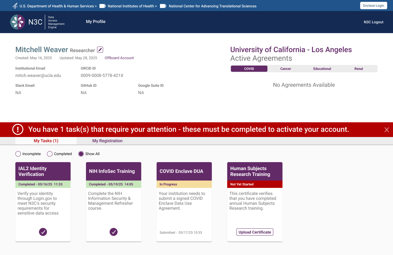
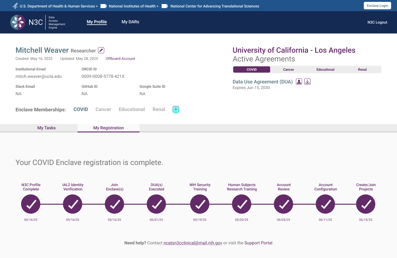
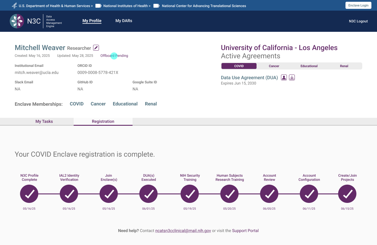
The single highest-impact structural change was replacing the unordered checklist with a task-based progress bar showing users exactly where they were, what they needed to do, and what was waiting on someone else. Task cards divided into two types: actions the user takes, and steps pending administrative review. The bar adapted per role — same pattern, different content.
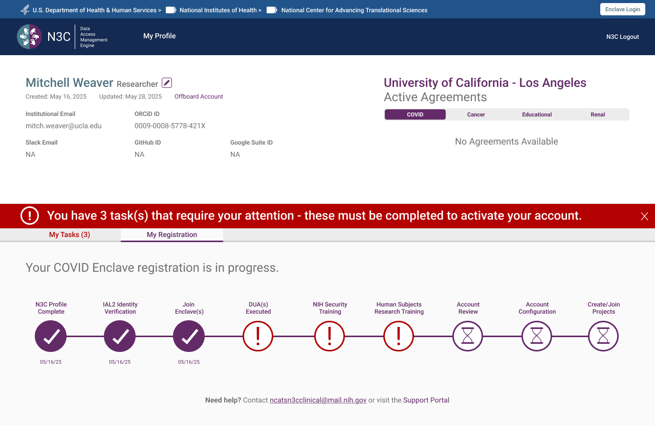 Task list on first login — enclave selected, tasks pending
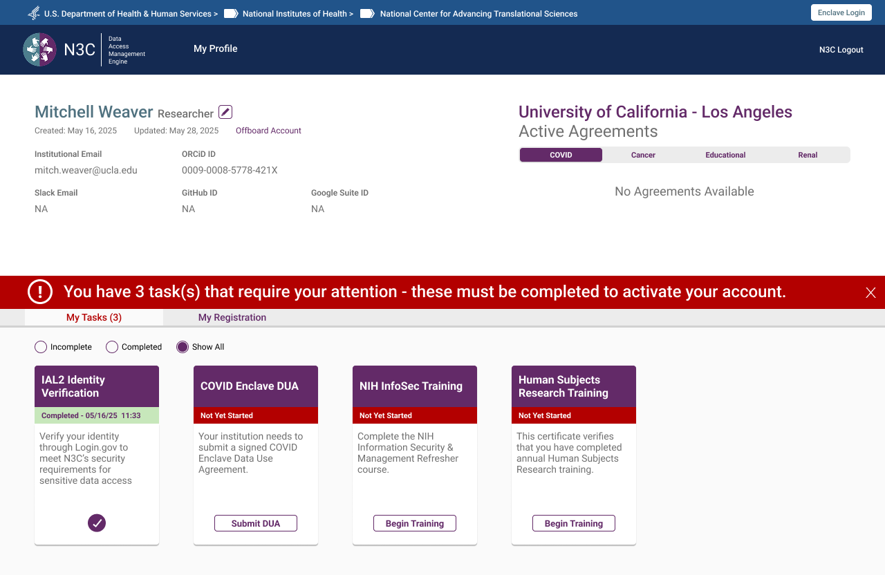 My Registration tab — sequential progress bar showing completed steps, outstanding tasks, and pending admin review
Persistent Alert Banner
An early design used a modal on login to surface outstanding tasks. Feedback from the NCATS Technical Lead was direct: make it something users can't miss. The solution was a persistent orange banner at the top of every authenticated page — dismissible per session, but reappearing on every login until all required tasks are complete — showing an outstanding task count.
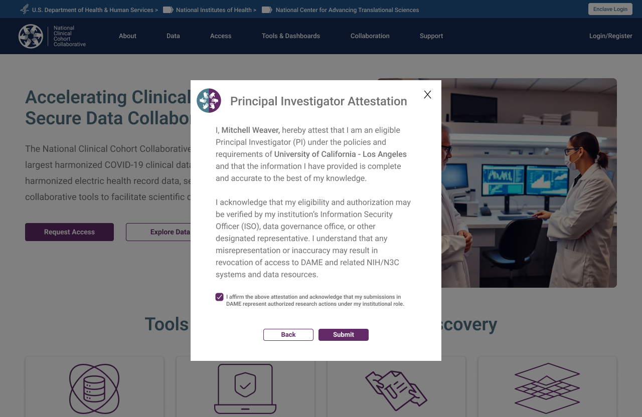
Institutional Accountability — PI Attestation
The CADR framework requires institutions to take explicit responsibility for the researchers they sponsor. This was surfaced as a Principal Investigator Attestation modal — triggered at profile submission — requiring the researcher to formally attest their eligibility at their named institution. The checkbox is required before Submit activates.
Parallel Completion
DUA processing can take 4–6 weeks. NIH security training takes hours. The original system's implied sequential structure caused researchers to wait on the DUA before doing anything else. The redesign made parallel completion explicit — users could work through every other required step while their DUA was in process, arriving at full approval with everything else already done.
Six Roles. Six Tailored Experiences.
One of the core architectural decisions was separating the registration experience by role type from the outset. Each role has distinct responsibilities, distinct required actions, and a distinct view of the system. Mixing them was one of the root causes of the original system's confusion.
Researcher / Principal Investigator
The researcher flow is the system's primary journey — from the public landing page through identity verification, institutional authentication, profile completion with PI attestation, enclave selection, and the task list. The institution DUA auto-check sits at the point of profile completion, triggering the decision tree if no agreement is found. Parallel completion of training and DUA processing is surfaced explicitly at the task list stage.
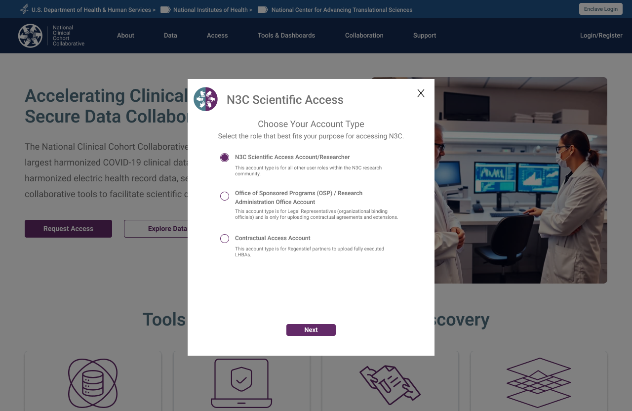 Step 1 — Account type selection, triggered by "Request Access" CTA
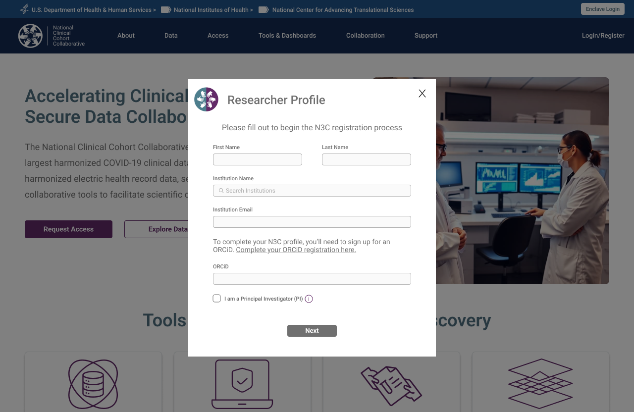 Step 2 — Researcher Profile form, launched on role confirmation
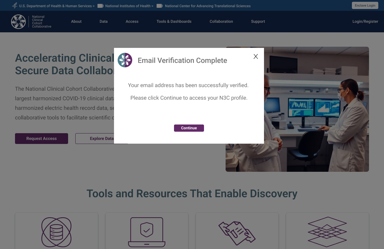
 Step 3 — Email verification triggered on profile submission
 Step 4 — Verification confirmed, researcher directed to their N3C profile
Stakeholder Requirement — Registration Status Visibility
A consistent ask in early stakeholder sessions: researchers had no way to know where they stood in the registration process after submitting. The My Registration tab was a direct response — a persistent progress tracker showing every required step, its completion state, and its timestamp, accessible from first login through to full activation. Not a new idea, but one that had never been implemented in the previous system.
Researcher — Adding an Enclave
Researchers who register for the COVID enclave may later want to add the Clinical or Tenant enclave. The "Add Enclave" flow triggers a new DUA check and surfaces a pre-populated contact card for the Signing Official already on file at their institution. The researcher confirms or updates the ISO contact, submits, and the request routes automatically — no need to re-navigate the full registration experience.
 Step 1 — Existing registration complete, new enclave requested via + button
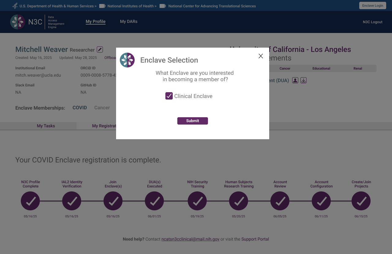 Step 2 — Enclave selection modal, Clinical Enclave chosen
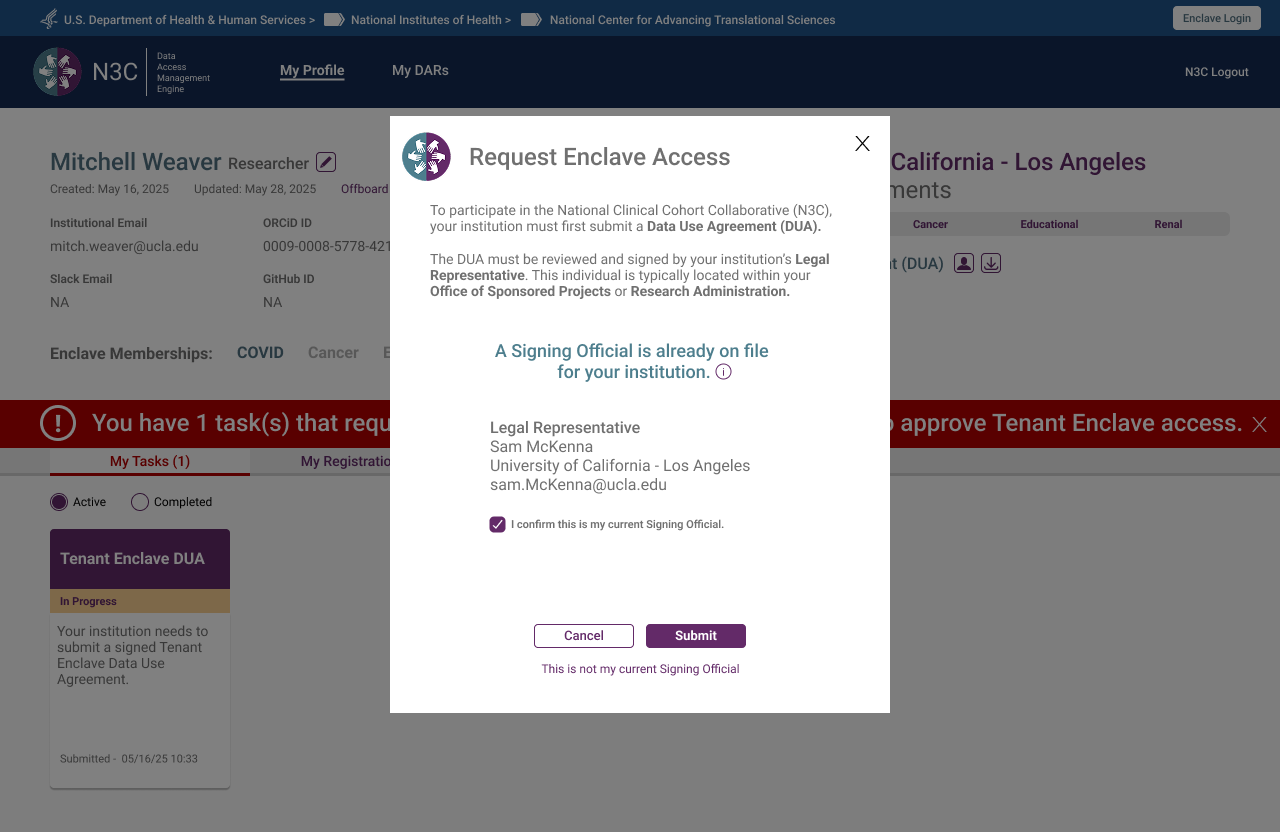 Step 3 — Signing Official pre-populated from institution record, researcher confirms or updates
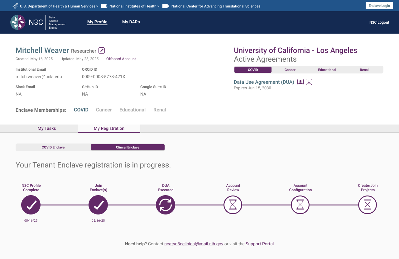 Step 4 — New enclave registration underway, abbreviated progress bar reflects only remaining steps
Researcher — Offboarding
Offboarding is accessible at any point in a researcher's account lifecycle — not gated behind a completed registration or active enclave membership. The flow is designed to be informative rather than bureaucratic: a researcher initiating an exit is shown exactly what access they hold and what will be relinquished, then asked to confirm deliberately. Clean, unambiguous, and available whenever it's needed.
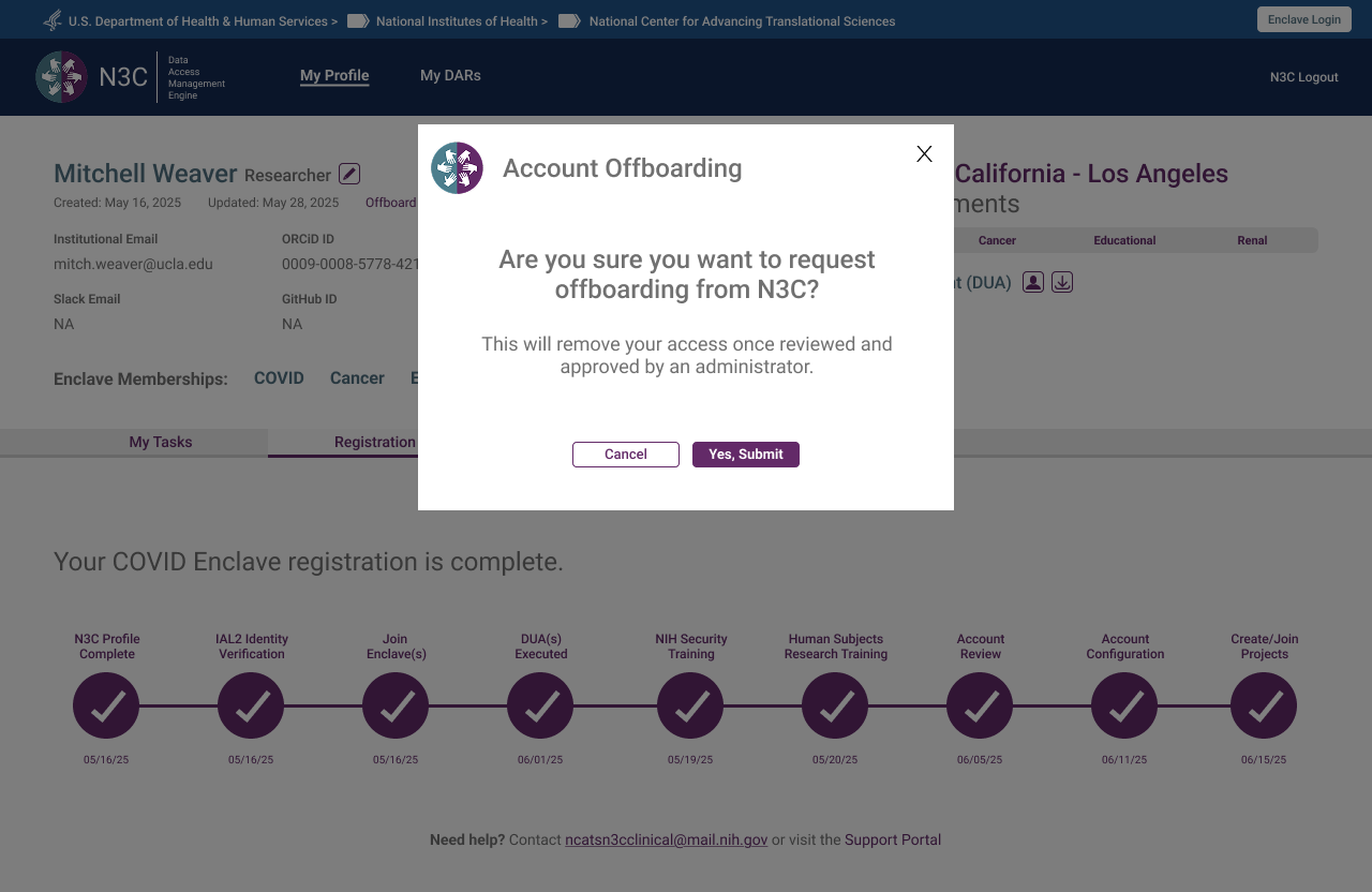 Step 1 — Deliberate confirmation required before any action is taken
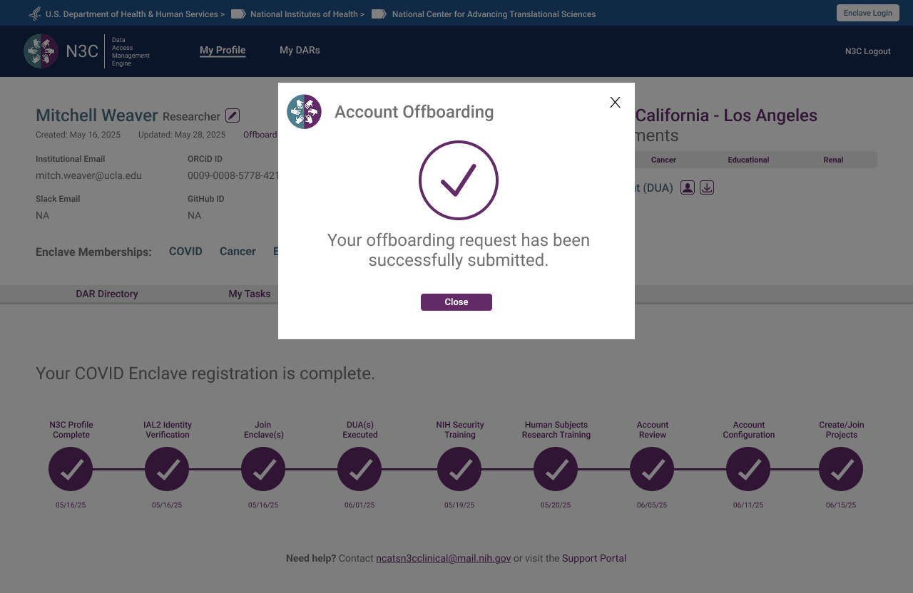 Step 2 — Request submitted, pending administrative review
 Step 3 — Profile reflects pending status, access remains until admin approval
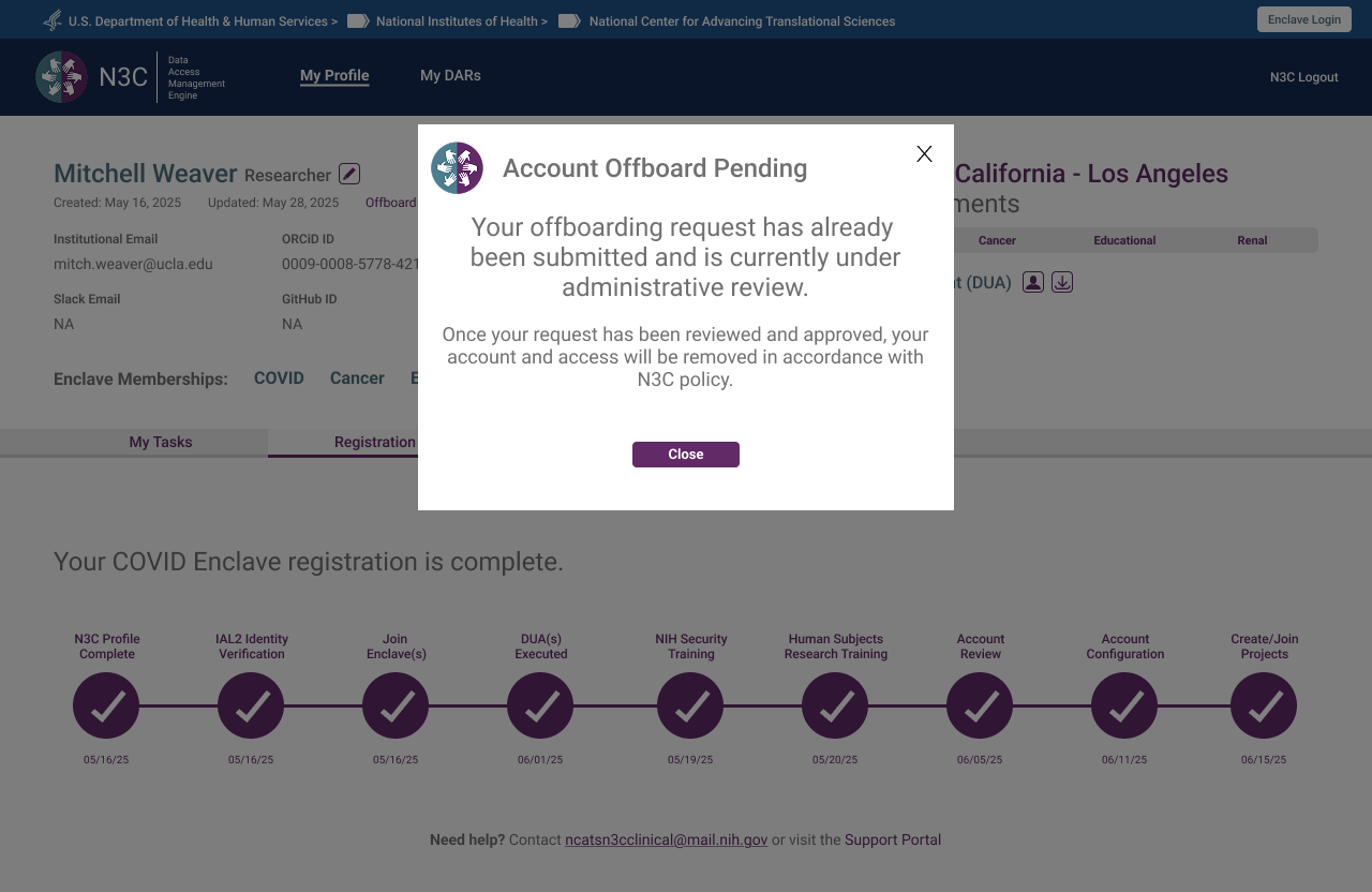 Step 4 — Returning users informed of pending review, no duplicate requests possible
Legal Representative
The Legal Representative handles all agreement uploads for their institution — a responsibility separated from the ISO Approver role, which early iterations had conflated. Their primary view is "My Agreements," structured around three distinct upload cards: COVID DUA, Data Transfer Agreement, and Linkage Honest Broker Agreement. The role selection screen was one of the most iterated in the system, because the two roles are institutionally distinct but often occupied by the same person.
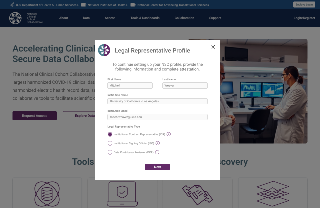 Unlike researchers, institutional roles are explicitly selected — the system needs to know what authority this person holds before routing them correctly
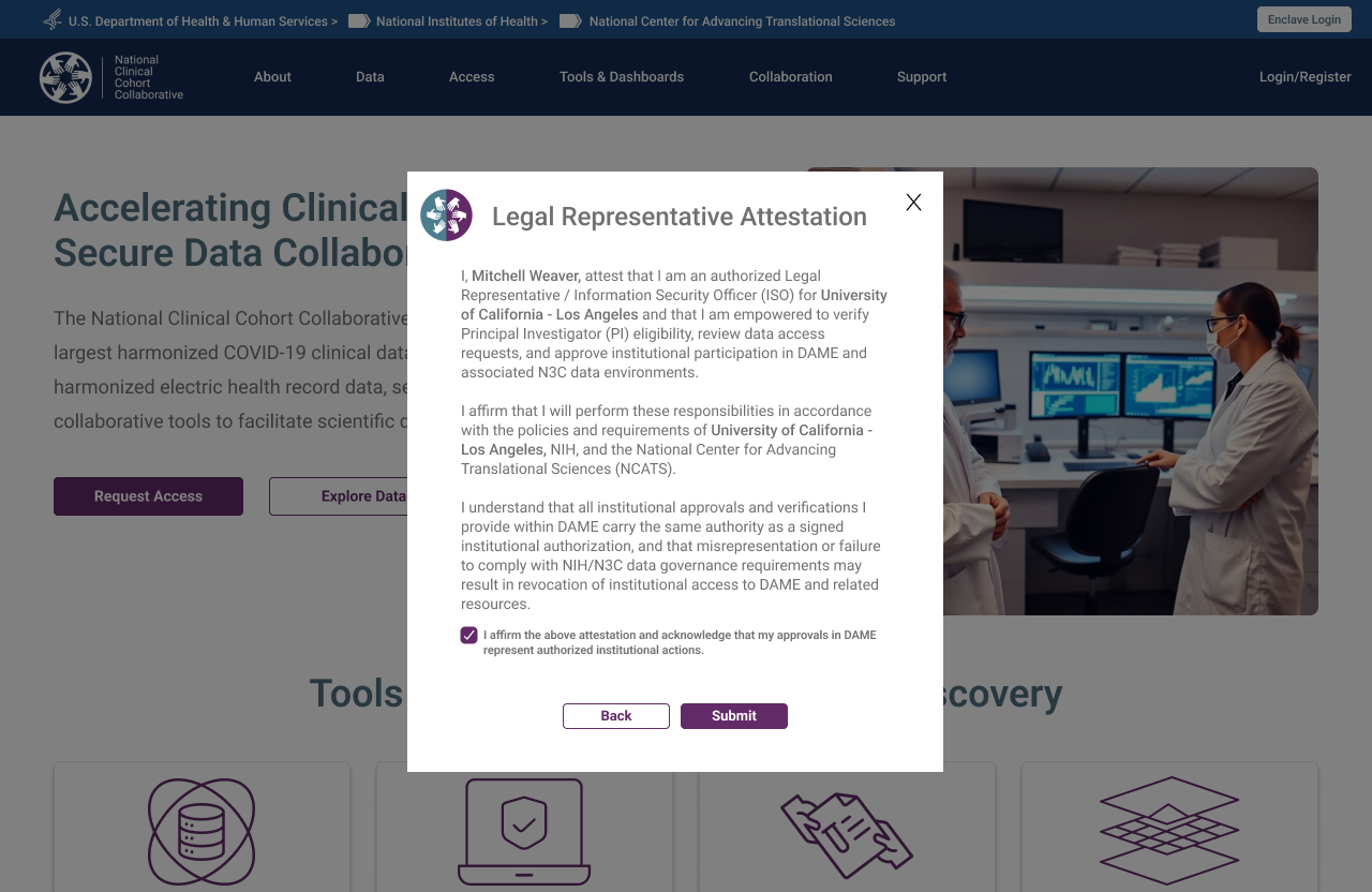 Institutional authority must be attested before proceeding — a step with no equivalent in researcher registration
ISO DAR Approval
The Institutional Signing Official is a CADR-mandated role responsible for reviewing and approving Data Access Requests submitted by researchers at their institution — authorising specific projects to access N3C data. The ISO view surfaces pending DARs in a structured review queue with review, approve, and send-back-for-revision actions. The DAR revision flow creates a clear communication loop without requiring off-platform email exchange. In practice, the Legal Representative and ISO are often the same person — the prototype below shows that combined DAR approval experience.
 DAR list — ISO's view of all submitted access requests, filterable by status
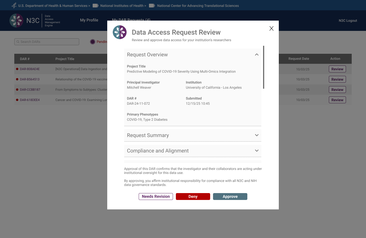 DAR review detail — full application context before the ISO takes action
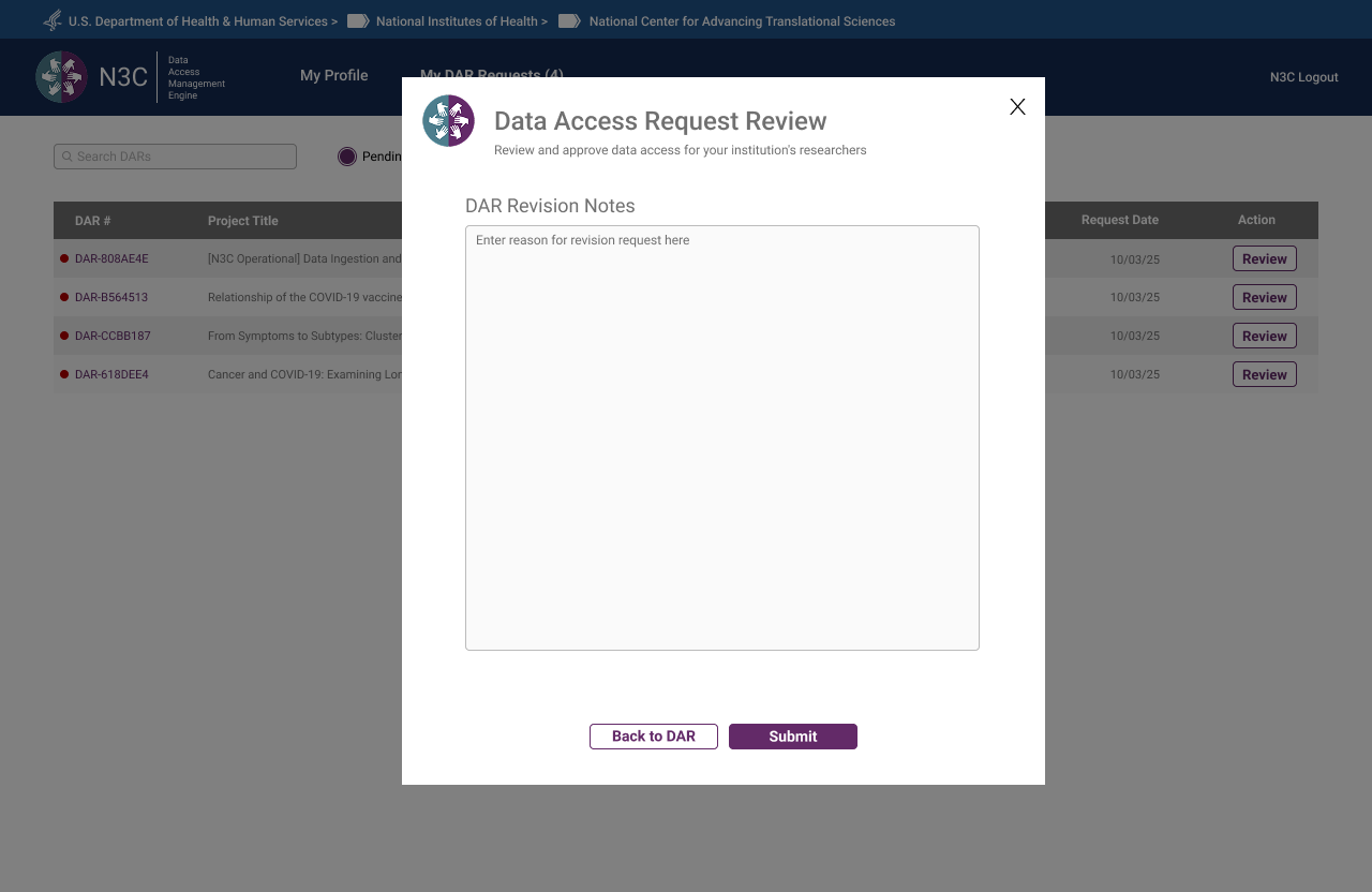 Revision request — ISO sends structured notes back to the researcher without leaving the queue
 Approval confirmed — DAR status updated, researcher notified
Data Contributor Reviewer
The Data Contributor Reviewer is an N3C-specific role — distinct from the CADR-governed ISO — responsible for reviewing access requests that touch data contributed by their institution to the Dynamic Workspace. Where the ISO approves general enclave access, the Data Contributor Reviewer specifically governs whether their institution's contributed data may be used in a given research project. The role name itself was finalised during a DAME prototype review session.
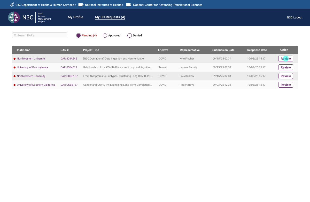 DC request queue — pending contributions awaiting review
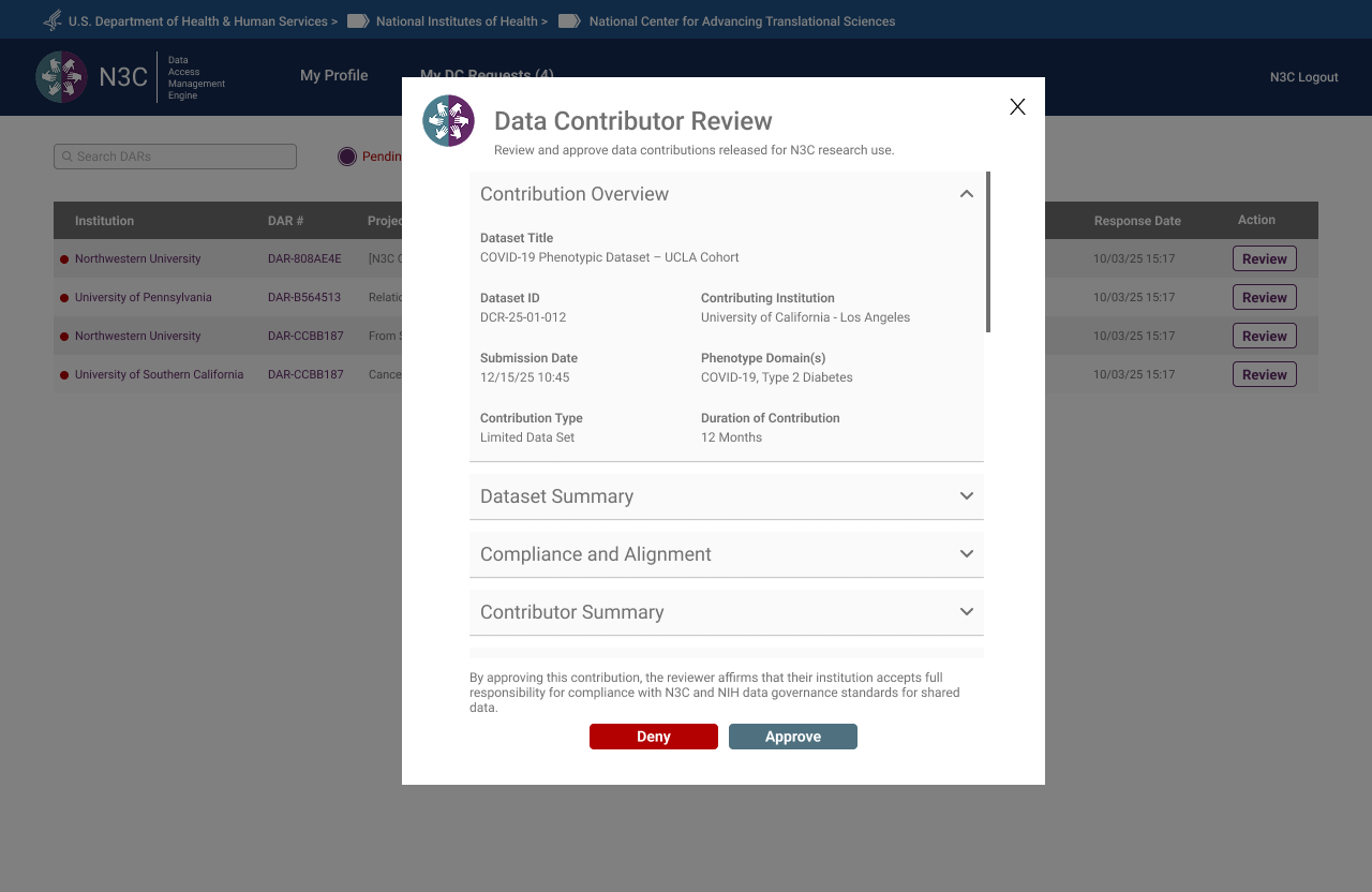 Contribution review modal — dataset detail, compliance context, and approve/deny actions
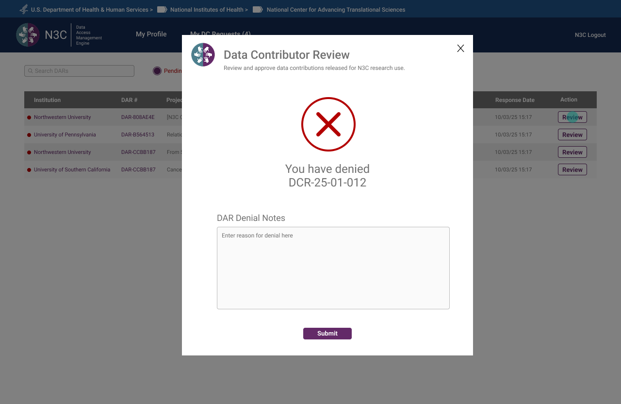 Denial confirmed — reviewer required to supply notes before submission
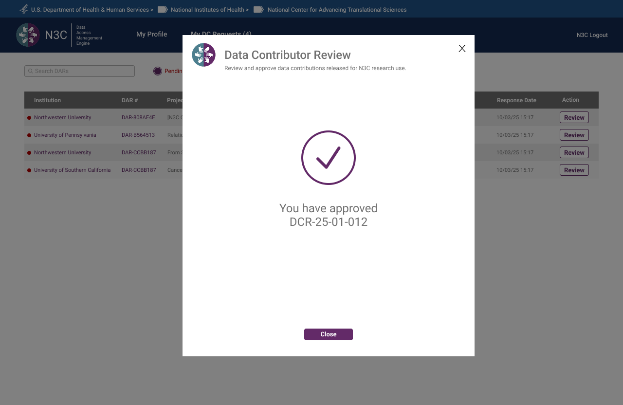 Approval confirmed — contributing institution notified, DC status updated
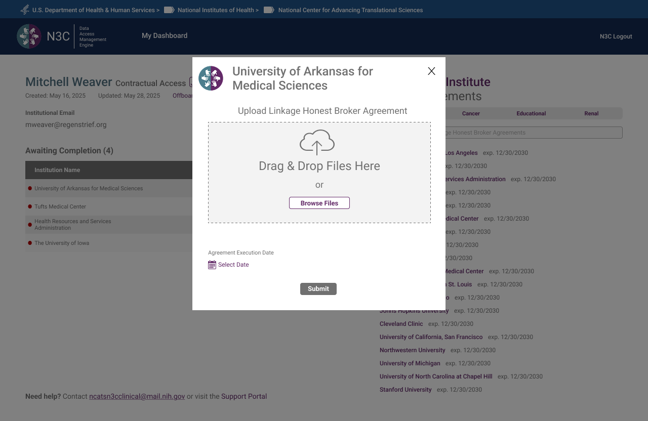
Contractual Partner
Contractual Partners upload Linkage Honest Broker Agreements on behalf of institutions. The interface was intentionally minimal — no banner, no multi-step progress bar, no extraneous information. A single drag-and-drop upload card, a submit action, and a confirmation. Complexity should match responsibility: a role with one core task should have one core screen. The NCATS Technical Lead reviewed this flow and offered no revisions.
 Step 1 — Dashboard showing pending LHBA uploads by institution and agreement type
 Step 2 — Upload modal launched from queue, institution pre-filled
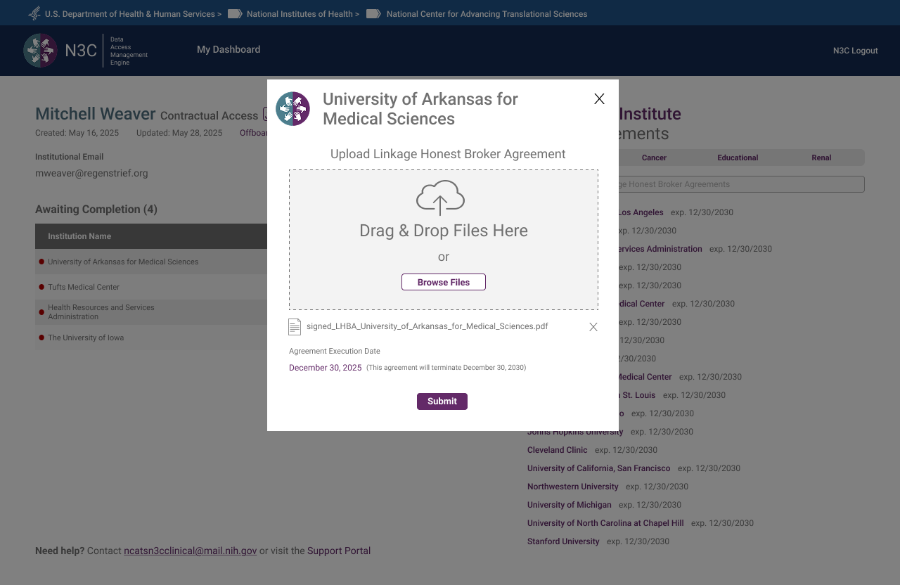 Step 3 — Both a file and an execution date must be provided before Submit becomes active
 Step 4 — Upload confirmed — institution's LHBA successfully submitted
What the System Looks Like From the Top
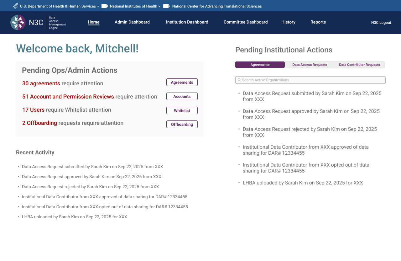
The OpsAdmin Dashboard and Org Pages were the last major surface designed — deliberately. As the Program Lead noted during an August check-in: the admin's capabilities needed to be determined by what all other roles required, not defined in advance and retrofitted. The result is a dashboard that reflects the full system — surfacing every pending action, every agreement in flight, every DAR requiring committee review, and every institution's compliance status in a single view.
OpsAdmin Dashboard
The dashboard opens to a personalised welcome with a live count of pending actions across four categories: agreements requiring attention, account and permission reviews, users requiring manual review, and offboarding requests. A Recent Activity feed surfaces the most recent system events. Tabs provide access to the full committee review workflow, institution management, reporting, and user administration.
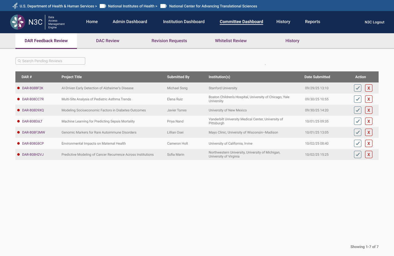 Committee Dashboard — DAR Feedback Review queue with project titles, institutions, and submission dates
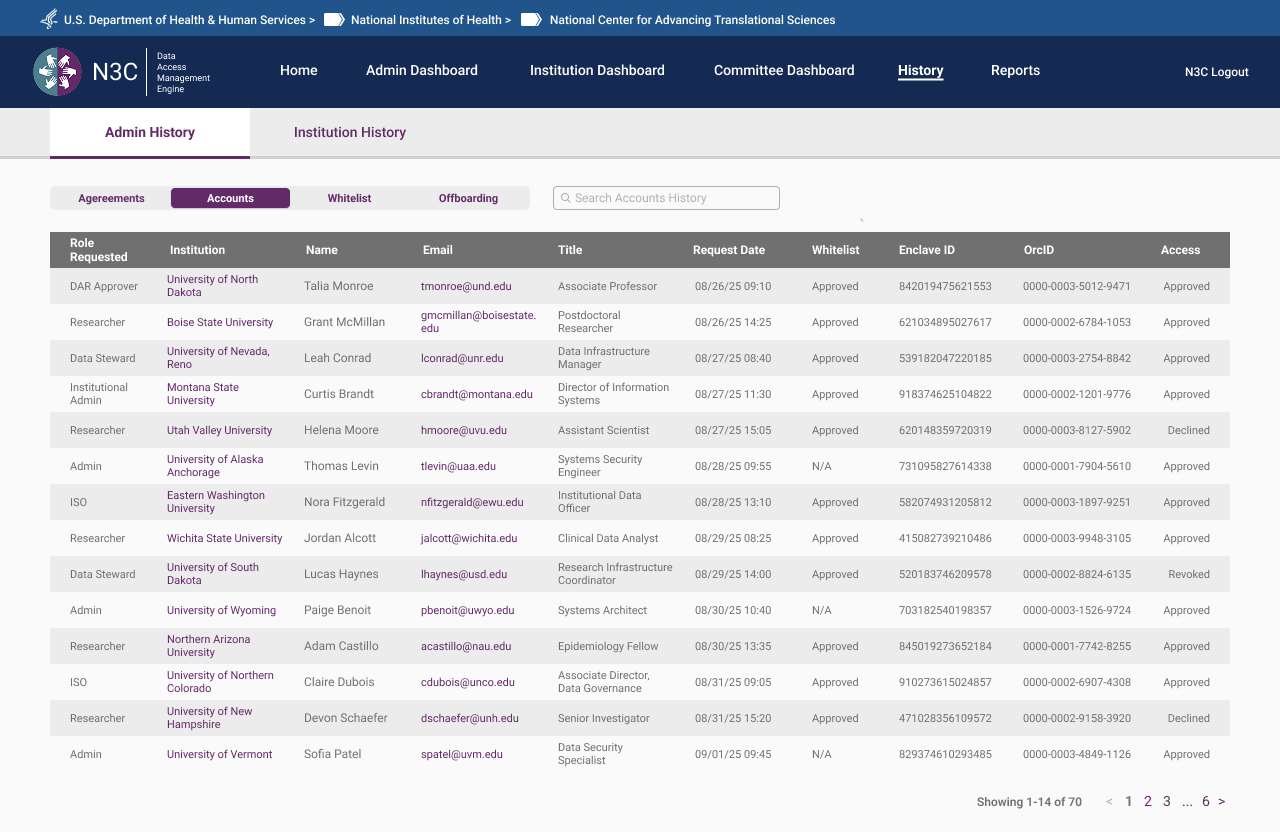 Admin History — full account audit log across all roles, institutions, and access decisions
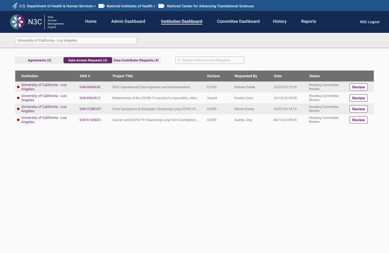 Institution Dashboard — DAR status across all requests associated with a given institution
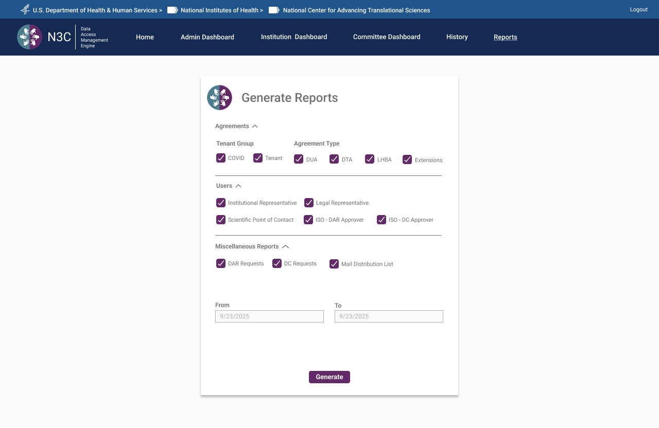 Generate Reports — filterable by agreement type, user role, and date range across all system activity
Org Pages — Same Surface, Two Experiences
Each institution has a dedicated Org Page — a single URL resolving to fundamentally different content depending on who's looking at it. The distinction isn't cosmetic. Researchers see a read-only window into their institution's status: active agreements, enclave memberships, and the DARs they're associated with. Admins see a full institutional control panel. Same page architecture, role-filtered at the content level.
Researcher View — Read-Only
For researchers, the Org Page is informational. It surfaces the institution's active agreements relevant to their access tier, their own associated DARs, and the contacts at their institution they may need to reach. No controls, no editing — visibility only. Designed to answer the question a researcher actually has: what's my institution's status and what does it mean for my access?
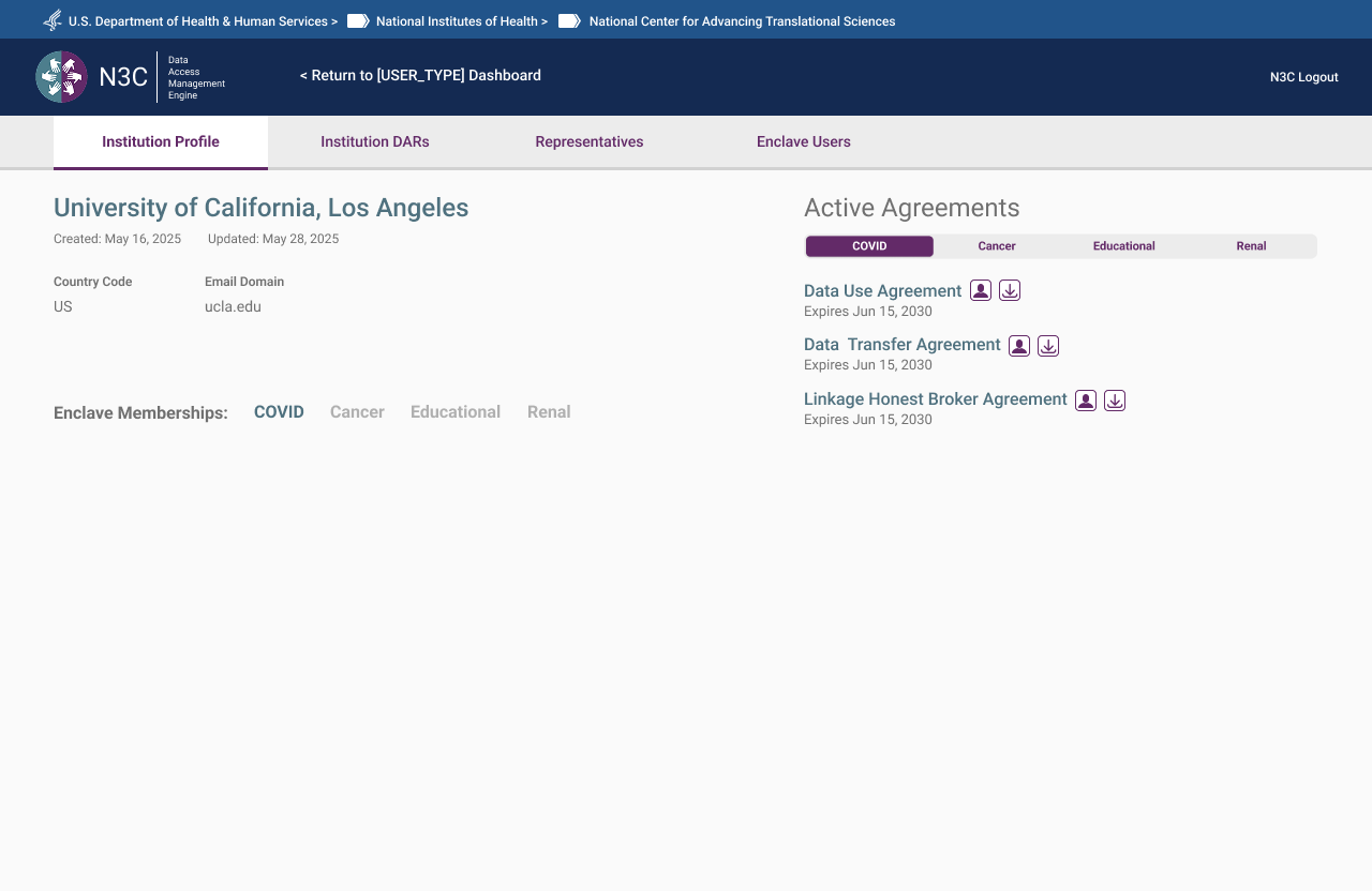 Institution overview — active agreements and enclave memberships. Read-only.
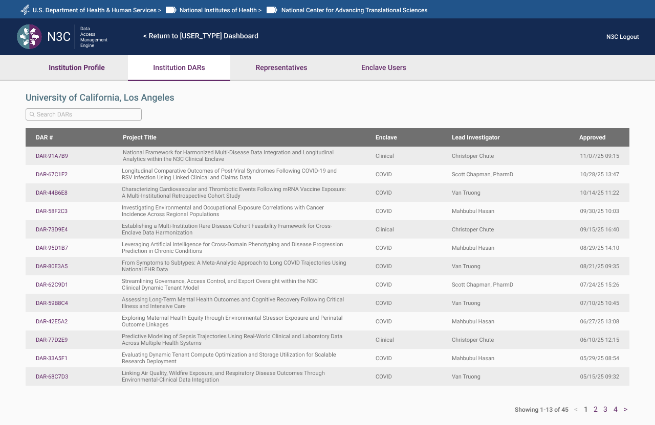 DARs view — associated Data Access Requests and current status, visible but not editable.
Admin View — Institutional Control
For OpsAdmins, the same page becomes a full institutional management surface. All agreements (DUA, DTA, LHBA) with status and expiry, assigned ISOs and Legal Representatives, enclave memberships, full DAR history, and direct management actions — edit, reassign, flag, remove. The admin view is the authoritative record for an institution's standing within the system.
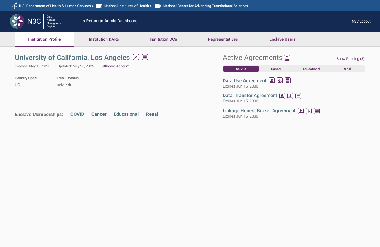 Institution Profile — active agreements across all enclave types with management controls
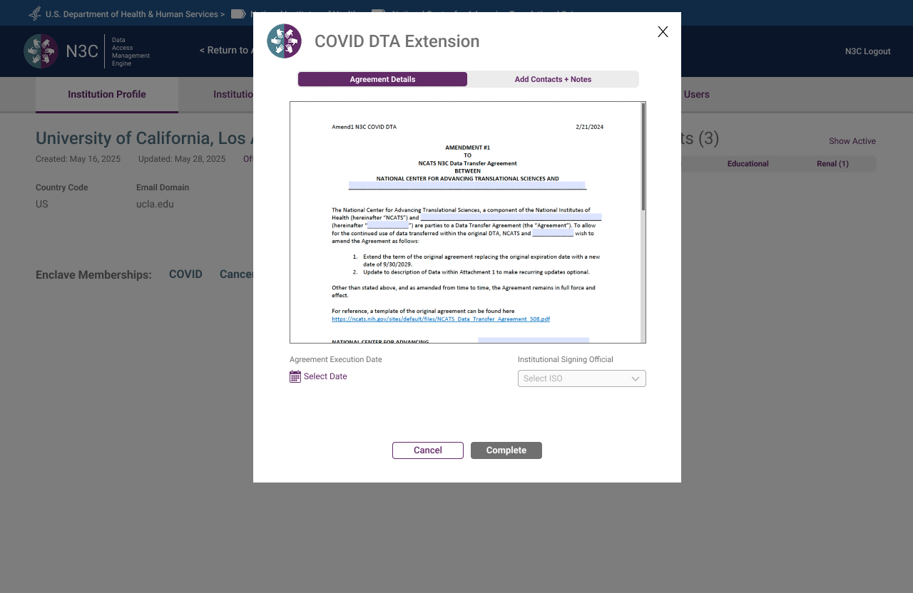 DTA Extension — document preview with execution date and ISO assignment before completion
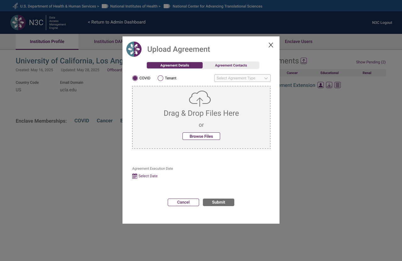 Upload Agreement — agreement details tab with enclave type, agreement type, and file upload
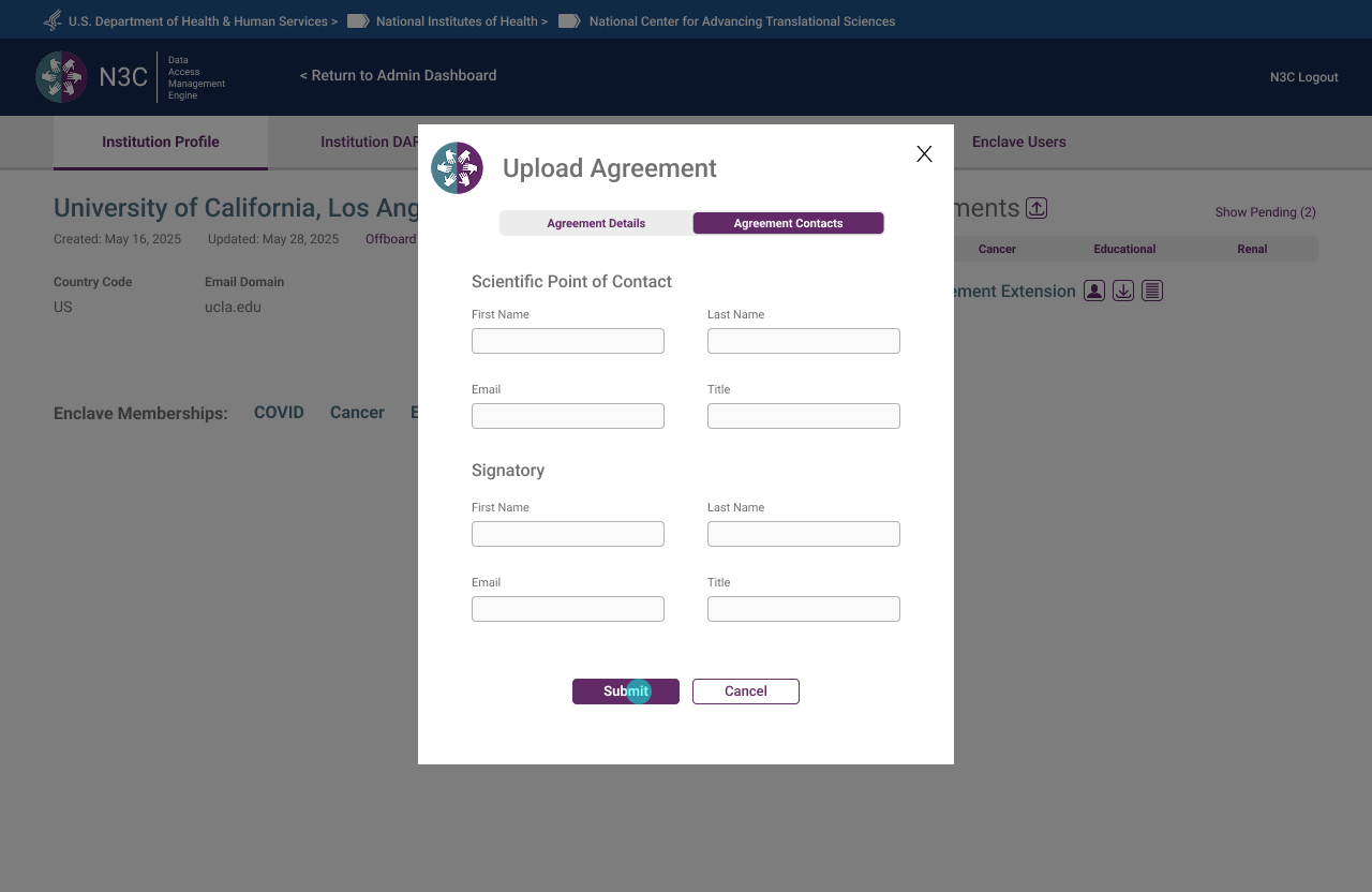 Upload Agreement — contacts tab capturing Scientific Point of Contact and Signatory before submission
 DTA Contacts — signatory and Scientific Point of Contact editable directly from the org page
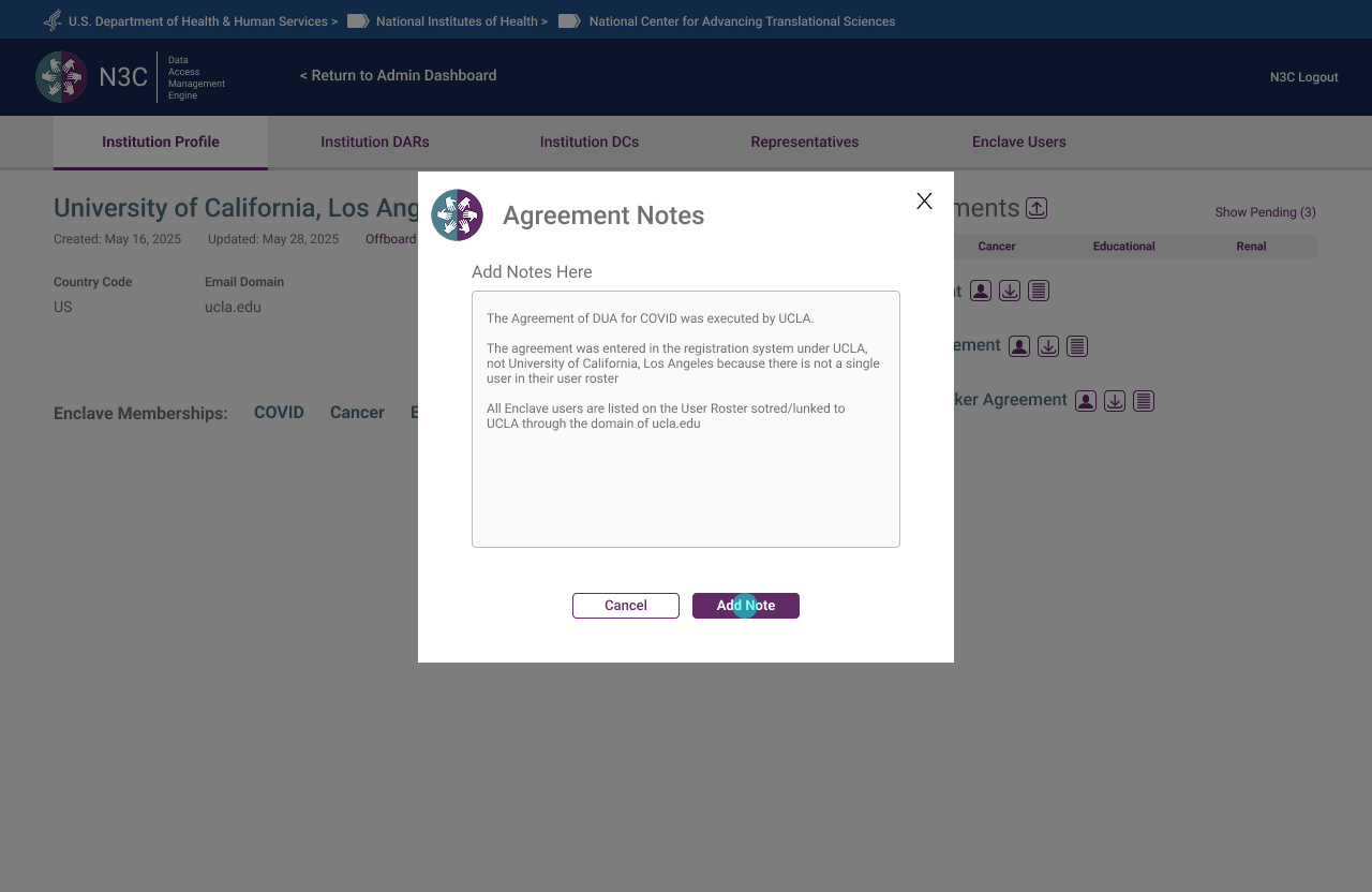 Agreement Notes — internal notes attached to agreements, surfacing institutional context for admins
What Seven Months of Twice-Weekly Reviews Taught Me
- The prototype is the most honest requirements document. Written briefs describe intent. A clickable prototype reveals assumption. Every session where the prototype surfaced an unmade decision was a session that saved weeks of rework downstream.
- Policy constraints are design constraints — and that's a gift. CADR governance didn't fight the UX work; it clarified it. Knowing exactly who could do what, under what conditions, made every role-based decision defensible and consistent. Ambiguity is the enemy of good information architecture.
- Visibility solves more problems than features do. Most of the friction in the original system came not from missing functionality, but from missing feedback. The progress bar, the persistent banner, the icon states — none added new capability. They made existing capability legible. That resolved complaints that had persisted for years.
- Naming is UX. "Roster" vs "Directory." "Representative" vs "Legal Representative." "ISO" vs "Institutional Signing Official." In a system where users may occupy two roles simultaneously, precise language is the only thing preventing them from landing in the wrong flow.
- Designing the exit is as important as designing the entry. The offboarding flow received the same design attention as onboarding — because a federal research data system that makes it easy to get in but unclear how to leave creates compliance risk. Graceful exits are part of the system's integrity, not an afterthought.